Clearing the Path to Go Live
Reduced drop-off after onboarding and drive faster program publishing by redesigning the provider homepage.
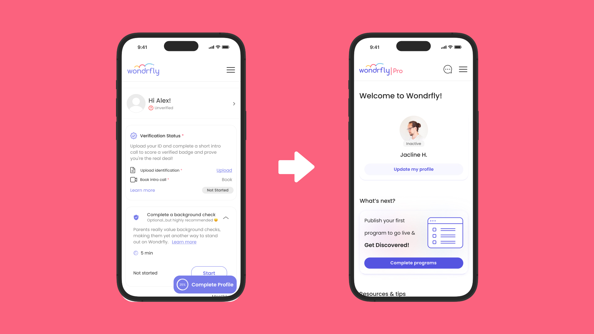
The Problem: A Journey That Prioritized Barriers Over Value
Result: Over 75% of providers abandoned the process before publishing a program.
When I inherited the Wondrfly Pro homepage, the structure actively worked against the core business goal: helping providers go live and get discovered. Three primary issues were immediately clear.
Issue 1 — Program publishing was not the focus. The homepage emphasized identity verification and background checks as the first visible steps. Asking sensitive information before providers experienced any value created a strong psychological barrier and immediate drop-off.
Issue 2 — Profile completion was treated as the North Star. A sticky "Profile Completion" CTA dominated the page. This was a UX anti-pattern: profiles are infinite by nature, but the UI framed them as a requirement to be finished before success.
Issue 3 — No clear primary action. Multiple CTAs competed with equal visual weight, with no hierarchy to signal priority. This diluted focus and forced providers to decide what to do next instead of guiding them toward activation.
.jpg)
Supporting issues amplified the problem:
- A visible verification wall before value was delivered
- An infinite progress trap with no clear definition of "done"
- No explanation of how Profiles vs. Programs actually impact discovery
- No onboarding education or support resources
Research & Validation
Understanding the Core Failures
Result: Clear evidence that early verification + profile pressure caused abandonment.
Before making design decisions, I validated all three primary issues through qualitative research, product data, and behavioral analysis.
Research Focus 1 — Early Verification Friction — Findings showed that providers perceived verification as risky and premature. Without seeing leads or visibility first, the request felt disproportionate and unsafe.
Research Focus 2 — Profile Completion Anxiety — Providers did not understand what increased their profile score or why it mattered. The percentage created stress instead of motivation, especially since a profile has no real endpoint.
Research Focus 3 — Lack of Clear Primary Action — Providers were unsure what to do first. Multiple CTAs competed with equal weight, creating hesitation and slowing activation instead of guiding it.
.jpg)
Strategy & Ideation
Resetting the North Star
Result: A clear strategic shift toward Program Publishing as the first success milestone.
I redesigned the homepage strategy around one principle: inactive providers need one clear, low-risk next step. This redesign also supported a broader product shift—from a booking-based model to a connection-based business model.
Key strategic decisions:
- Program Publishing becomes the primary action
- Profile updates become secondary, supporting trust—not blocking discovery
- Verification moves later, after value is experienced
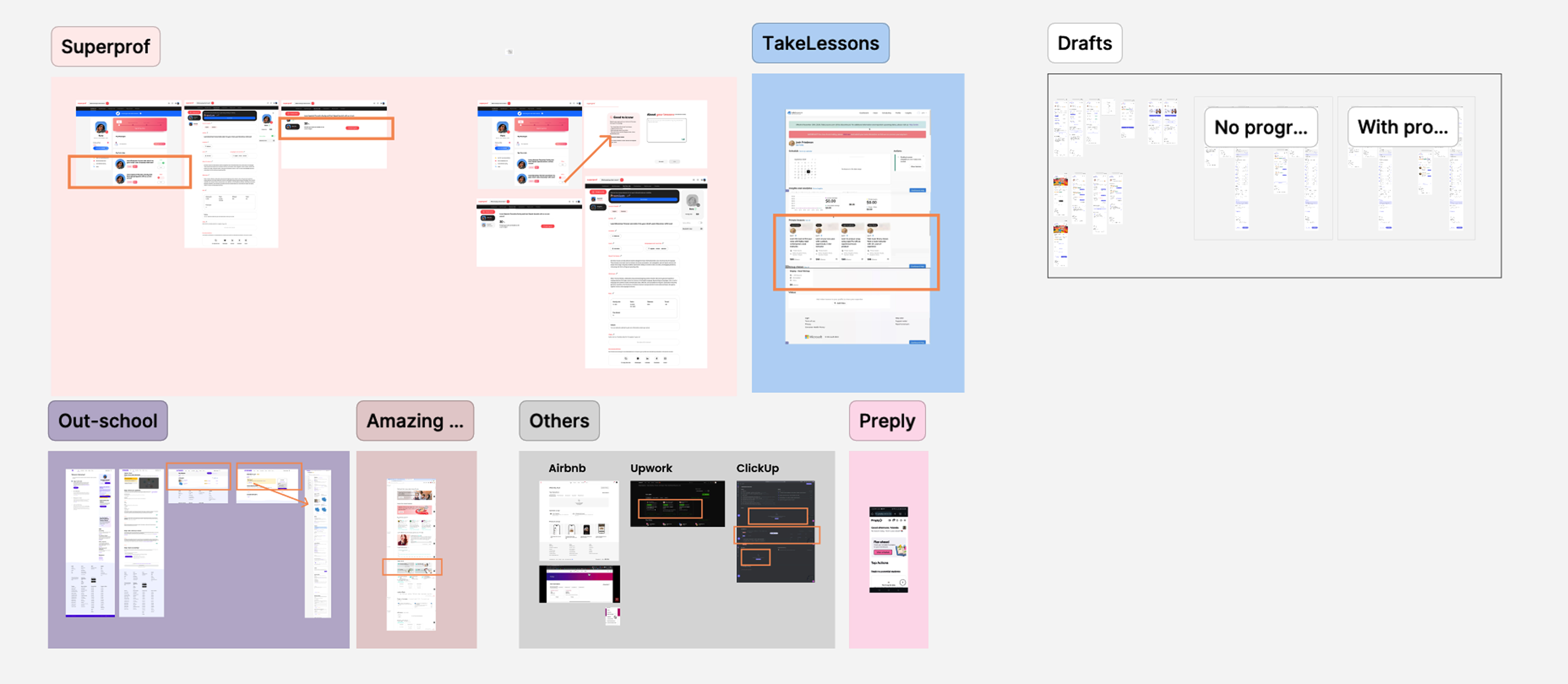
Solution Exploration
Low-Fi → High-Fi Iteration
Result: A focused, step-by-step homepage experience.
Working closely with the founder, I explored multiple layout and flow variations. Three core themes guided all concepts:
- Layout & Focus: One primary action at a time
- Removing First-Time Friction: Hide verification until it's contextually relevant
- Clarifying the Value Path: Make discovery logic visible and motivating
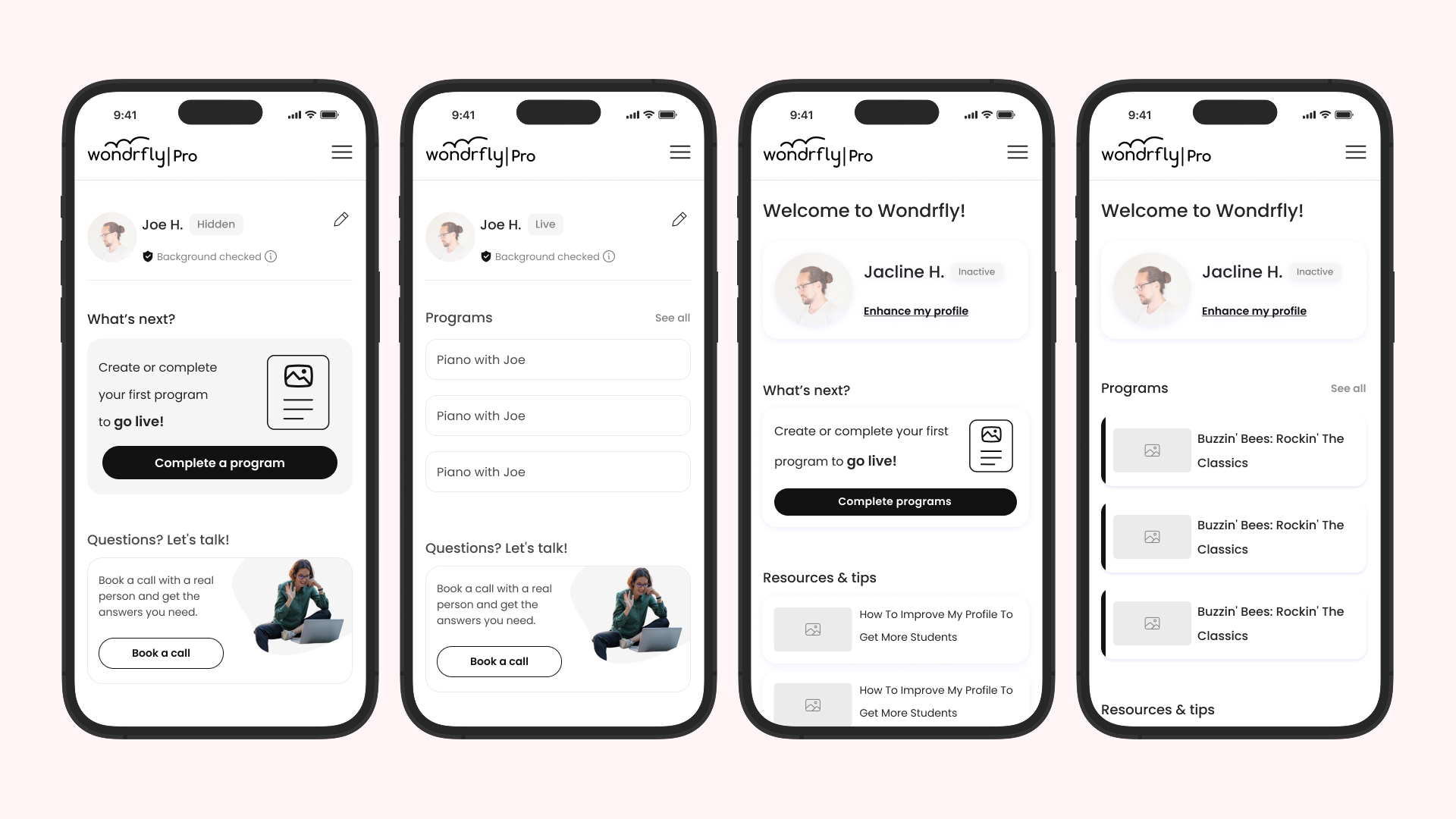
Visual Design & UI Refinement
Result: Stronger hierarchy and higher engagement.
Initial feedback showed the UX was solid, but the UI felt too flat. A single-color design failed to pull attention toward the primary action.
I iterated by:
- Introducing stronger color contrast
- Using brand colors strategically to signal priority
- Refining spacing and layout to increase energy and motivation

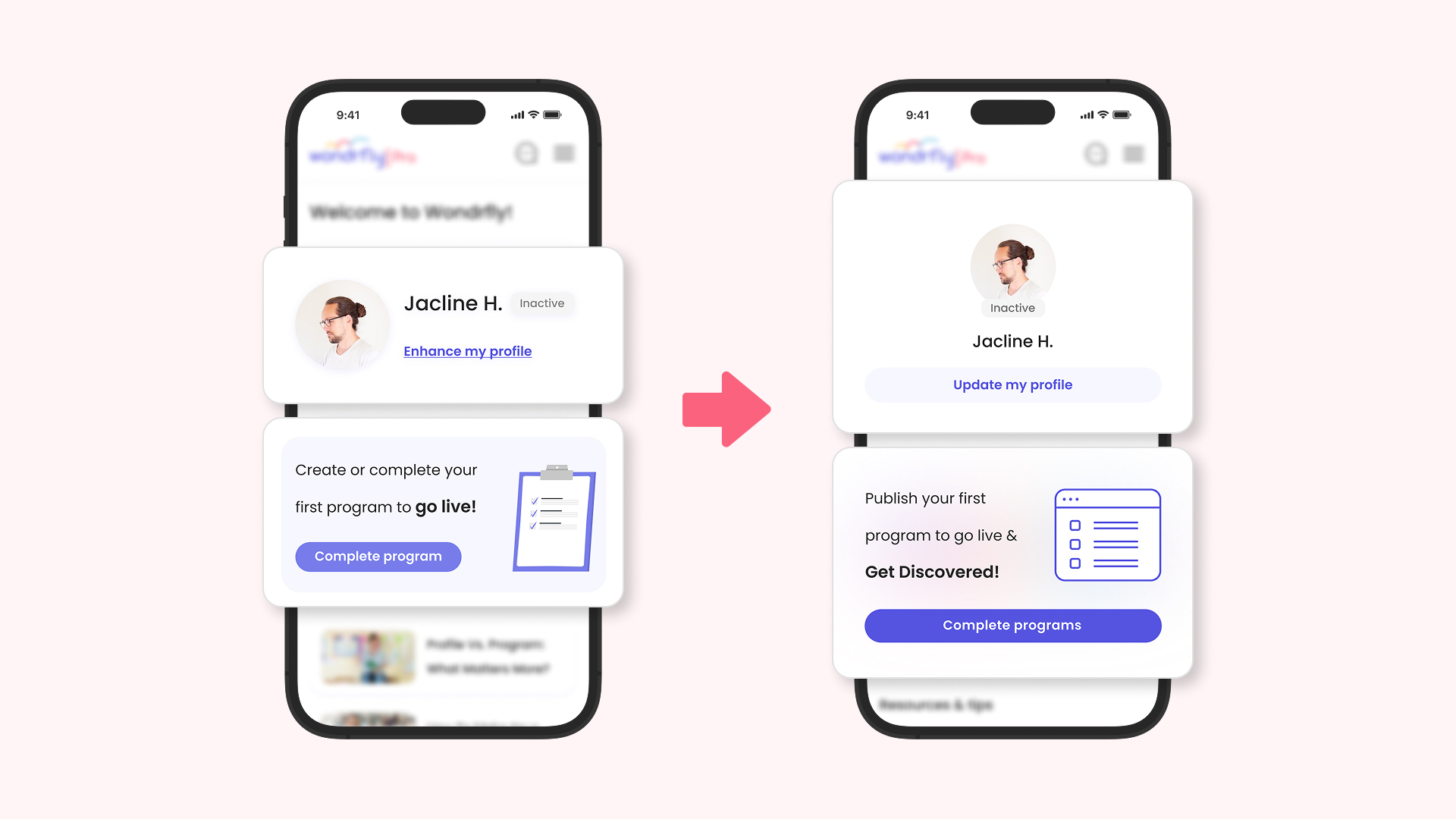
Copy & State-Based Scenarios
Result: Clearer mental models and reduced confusion.
Working with Content Designers, we refined messaging to better connect effort with value. The main headline evolved to:
"Publish or complete your first program to go live & get discovered."
I also designed copy logic for multiple states:
- Providers with hidden programs
- Providers blocked only by verification
- Contextual education titles
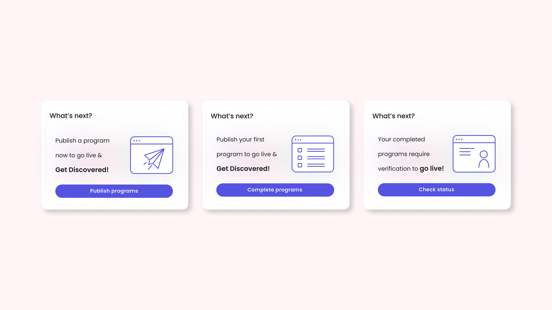
MVP Framework
Result: A scalable structure that adapts to provider state.
The final MVP framework included:
- High-Attention "Next Action" Section — A prominent section dedicated to the single most important action: publishing a program.
- Infinite Profile Concept — No percentages, no failure state. Profiles evolve naturally.
- Educational Articles — Clear explanations of how actions translate to visibility and leads.
- Flexible Progression — Providers can explore freely, while the UI still clearly signals what matters most.
.png)
Information Architecture
Result: Reduced cognitive overload and clearer decision-making.
I mapped homepage content by provider status and subscription plan. This allowed the experience to feel personalized while maintaining a strict visual hierarchy.
Key decisions:
- Primary CTA: Publish first program
- Secondary CTA: Update profile
- Verification only appears when it is the final step to go live
.jpg)
Redefining "Completeness"
Result: Removed pressure and replaced it with guidance.
I removed the profile completion percentage entirely. Instead, the UI communicates progress through meaningful milestones:
- Publish a program
- Improve the program
- Enrich the profile over time
To compensate for the lack of a support center, I introduced a Resources & Tips section at the bottom of the homepage. This section surfaces three key articles explaining:
- How programs and profiles work on Wondrfly
- What actually improves discovery
- Practical tips to stand out
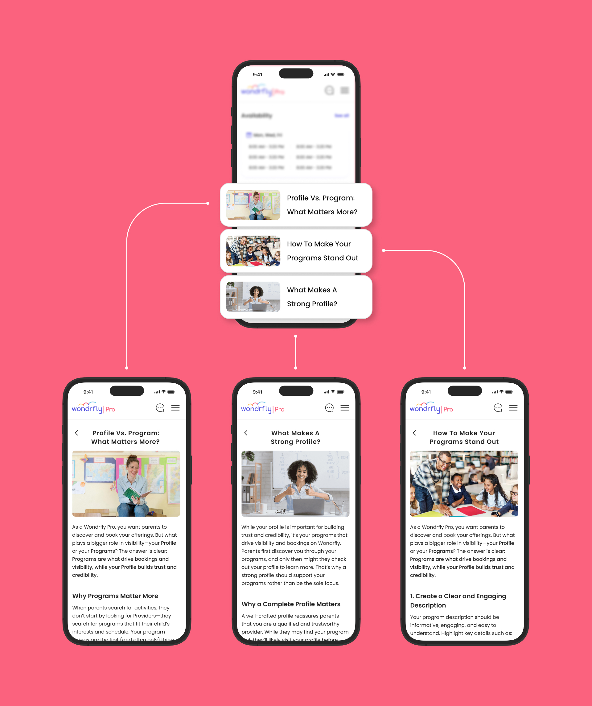
Impact & Outcomes
Result: Faster time-to-value and higher retention.
Within two weeks of rollout:
- Churn decreased significantly
- Retention and DAU increased
- Providers published programs earlier in their journey
.jpg)
What's Next: Scaling Trust
Result: A future-proof homepage strategy.
Post-launch research showed that once providers are live, trust signals become the next growth lever. I led the design of a Trust & Credibility System (reviews & social proof), strategically surfaced only for live providers.
This preserved the homepage's core logic:
- New providers → Publish programs
- Live providers → Build credibility
The homepage remains a focused, high-converting tool as providers grow their business on Wondrfly.