Gmail App Redesign — UX Case Study
We are always looking for new topics to learn more and subscribe to new newsletters to find new content daily in our mailing platforms. In the journey of learning new expertise, learners look for inspiring content.
Why We Are Designing This
The email system is used as a platform for marketing from companies. Companies know email marketing as the highest ROI technique to connect with their customers. But based on our research, users are not happy with this huge amount of emails that cause them to miss the important ones. Content creator community uses email marketing to send essays and blogs, but users who subscribed to the newsletters with special purpose can't find them—and this is frustrating for them.

Our Goals
- To increase the number of reading newsletters.
- To build incentives of reading newsletters amongst the sea of received emails.
- To increase users' satisfaction to find useful newsletters.

Our Proposal
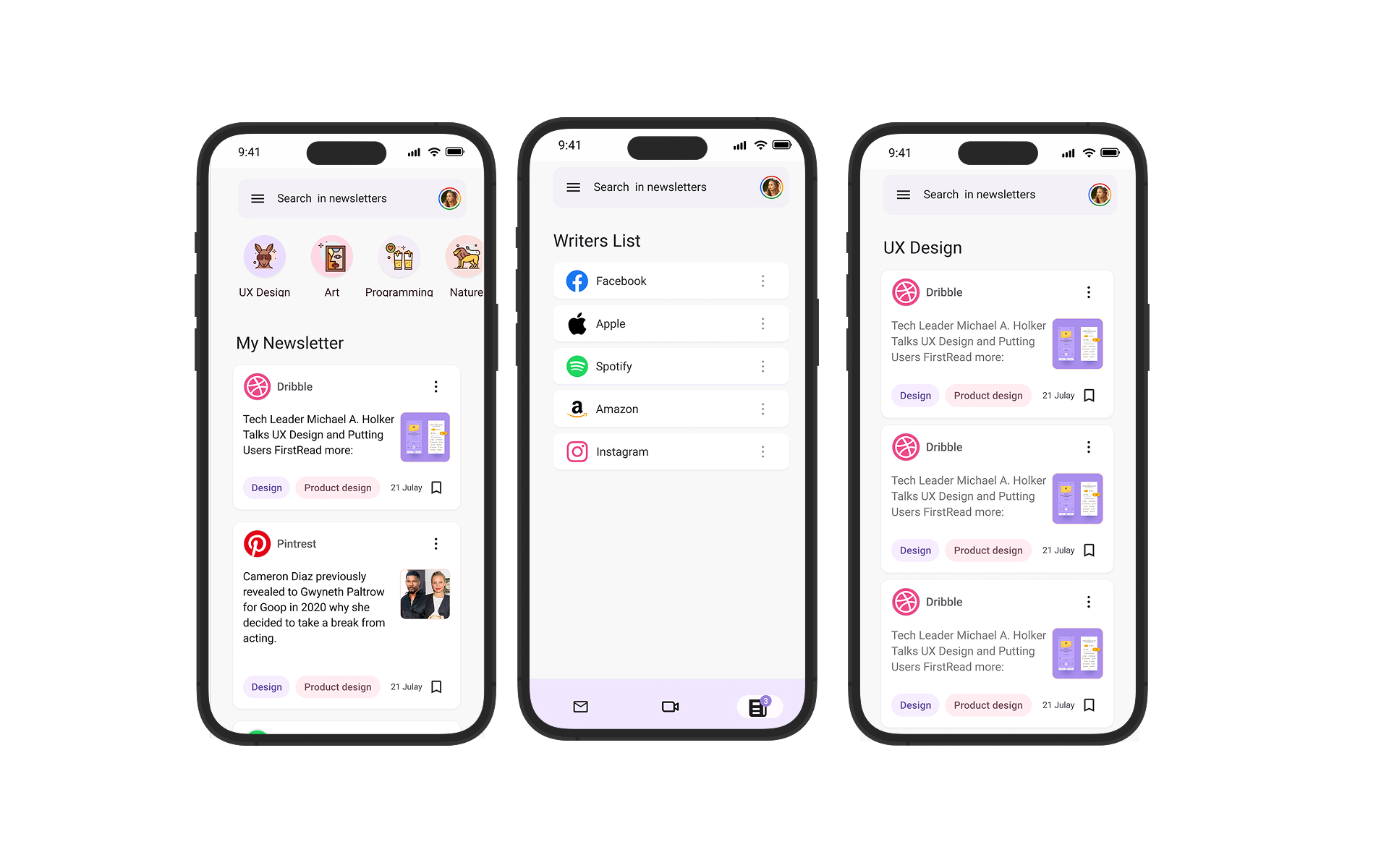
Instead of overhauling the existing Gmail app, we will add a subtle and useful feature to the main page called Newsletter. That will enable the user to receive their newsletters in a professional environment and will enable them to use Gmail as a "learning platform."
This will enable the user to read newsletters more easily, manage them, follow new ones, and know the writers better. We also help them to save the newsletters to manage the knowledge that they collect.
Research
Desk Research
We started our research process with secondary research. We were looking for the facts and statistics that show us how newsletters and the Gmail platform connect together, and whether it is important for companies and Gmail to stay focused on the newsletter or not. We want to know if our problem is a real problem and whether we can help business (Gmail and content creators) to satisfy their users.
Key findings:
- One of the three best strategies for marketing with highest ROI is: email marketing, SEO, and PPC.
- Gmail is the best email app: high-grade security and spam filtering, integration with other Google apps, lots of storage space, and it's affordable.
- Gmail has 1.8 billion users worldwide in 2022. 67% of people use Gmail, 19% on a daily basis.
- 60% of Gmail users are 18–29 years old, and 75% of them check their Gmail on their phones.
- 87% of marketers use email marketing.
Based on our research, learners between the ages of 25–39 go to websites and subscribe to newsletters with the hope of finding the best essays in emails. Although 11.9% of users constantly check the Promotions tab, this shows that a great potential in Gmail is being wasted.
Target User & User Interviews
In this project our target users were people aging 25–39, both men and women. They were all Gmail users whether using iOS or Android. All came from a community of self-taught programmers and designers, either working or learning.
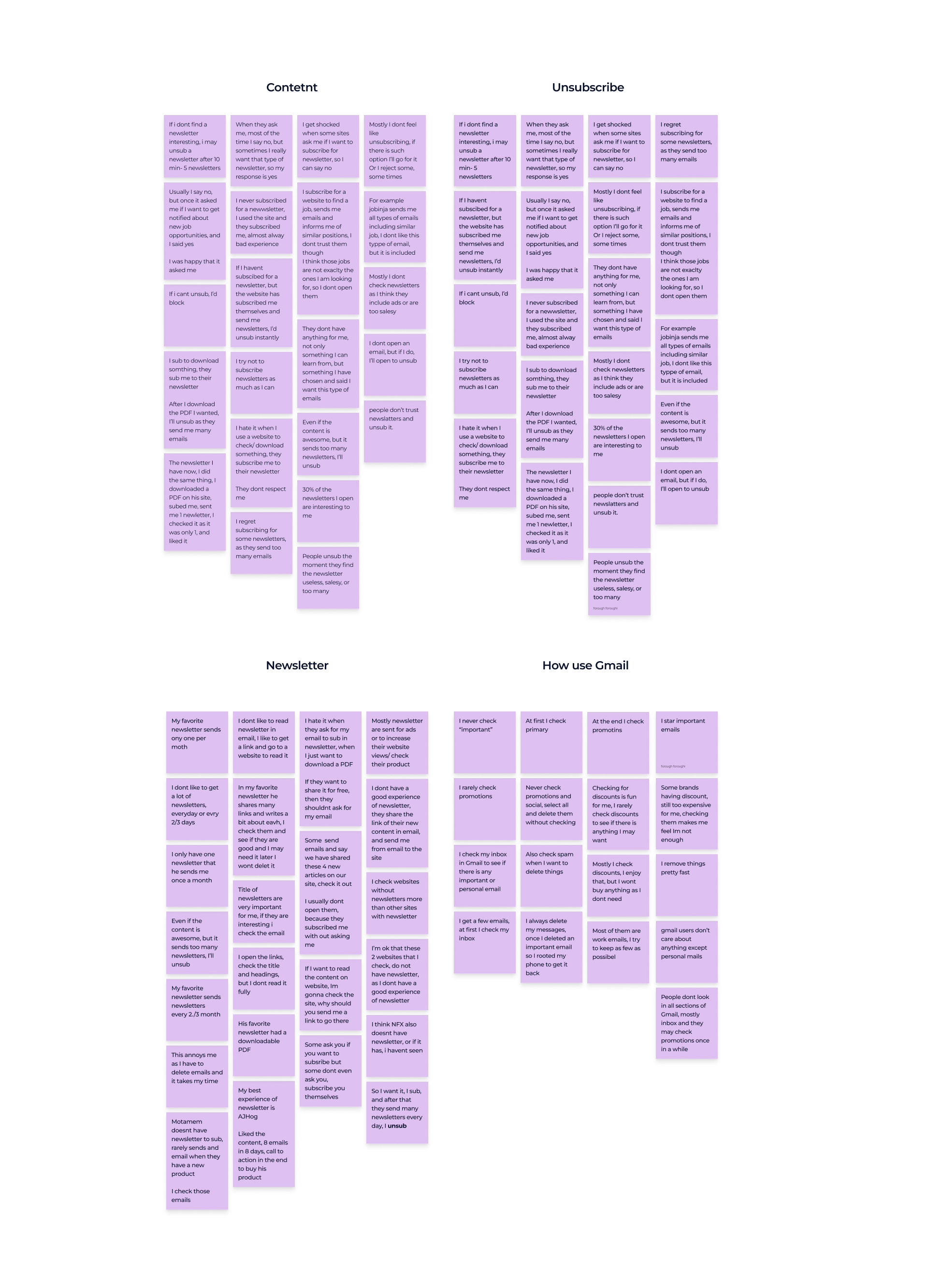
We conducted potential user interviews (4 people, aged 17–29, semi-structured, documented as an affinity map) to get familiar with users' pain points and behaviours in dealing with newsletters in Gmail.
Survey
69 people participated. Results:
- 59% of participants are learning a new profession.
- 59% of participants check their Gmail and 70% read newsletters every day in their free time, either at home or on their way.
- 37% of participants claimed that only less than 10% of emails they receive are relevant; 41.7% believed that less than 10% of newsletters they receive are relevant.
- 87% of participants read 1–2 newsletters per week.
- More than 58% of working users check their email from home when they are free. 62% believe less than 30% of emails are irrelevant to them. 60% prefer to delete all irrelevant emails.
Design Principles
After our research and user interviews, we came up with a set of design principles to follow while designing. We want to maintain the direct relationship between the interview results and our UI design.
- This is your home: Users get confused during checking emails every day and in free time—free time and being home help us to know they are not in traffic and have more attention.
- Clear: Make easier the management of archive and unsubscribe; it should be more clear.
- This is same as old Google: Google is the most popular email platform and we don't want to change the experience of users to make them feel it is a different environment.
Empathy Map & Persona
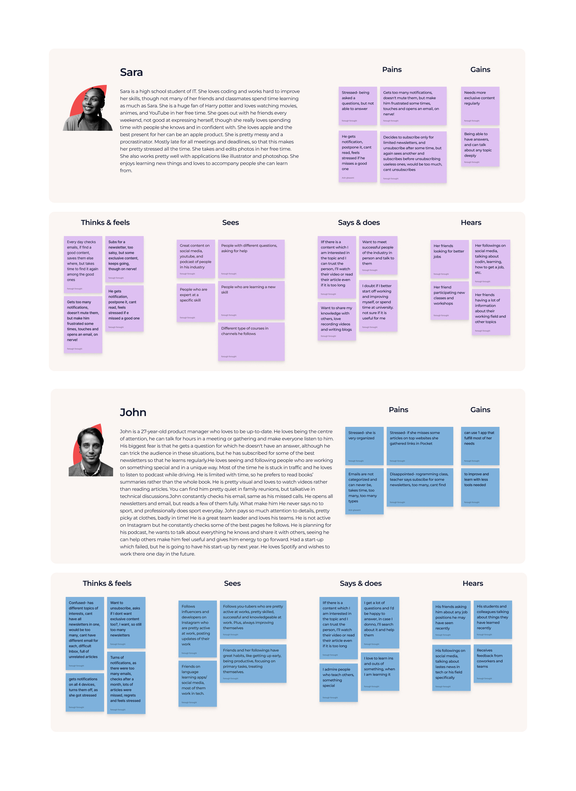
After interviewing users and delivering a survey, we came up with an empathy map. Documenting our understanding of who our users are, what they need, see, say, do, hear, think and feel makes a helpful empathy map for us.
Persona example: Sara is a high school student of IT. She loves coding and works hard to improve her skills. She is a huge fan of Harry Potter and loves watching movies, anime, and YouTube in her free time. She enjoys learning new things and loves to accompany people she can learn from.
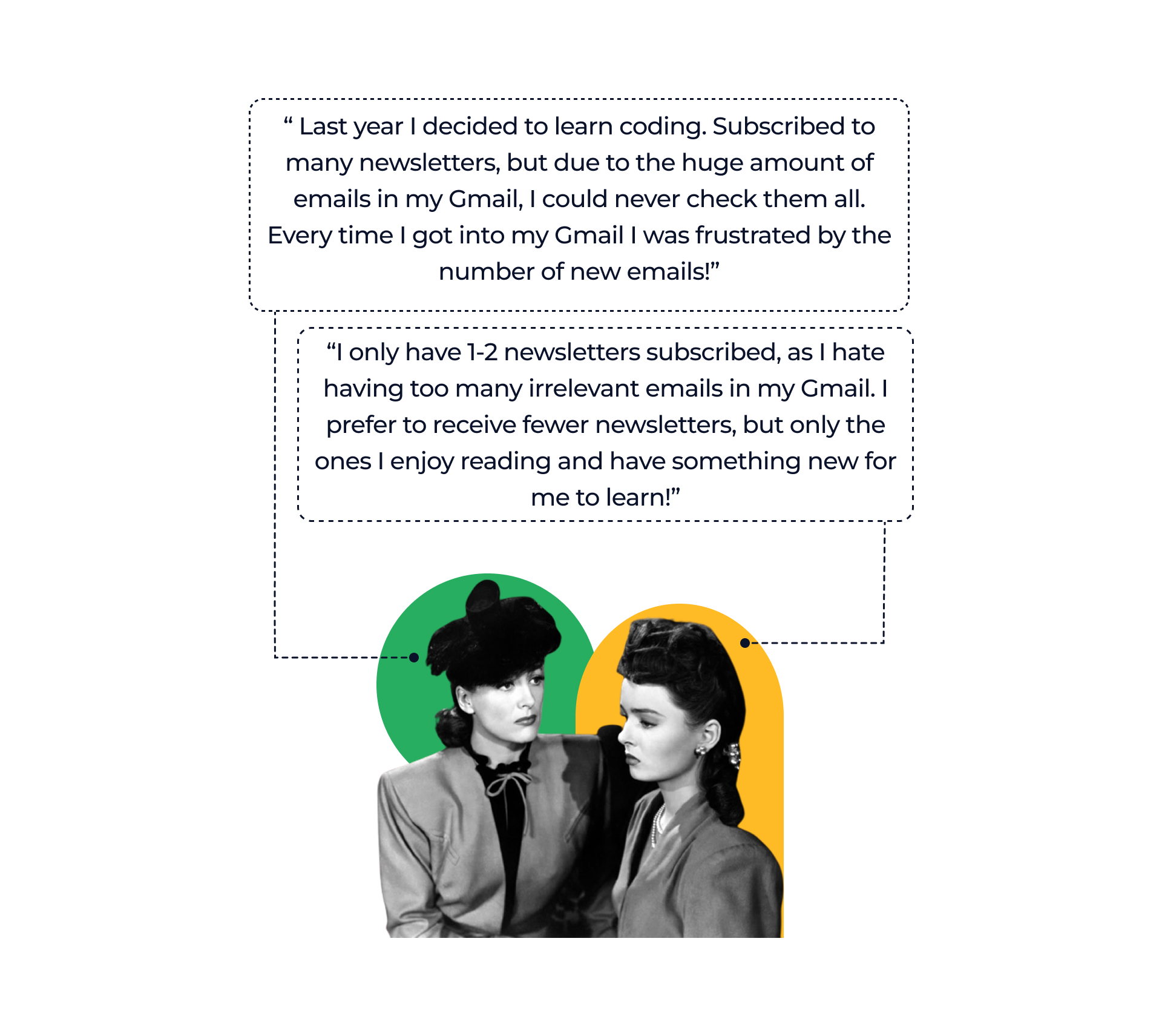
User insights included: "I only have 1–2 newsletters subscribed, as I hate having too many irrelevant emails in my Gmail. I prefer to receive fewer newsletters, but only the ones I enjoy reading and have something new for me to learn!" and "Last year I decided to learn coding. Subscribed to many newsletters, but due to the huge amount of emails in my Gmail, I could never check them all. Every time I got into my Gmail I was frustrated by the number of new emails!"
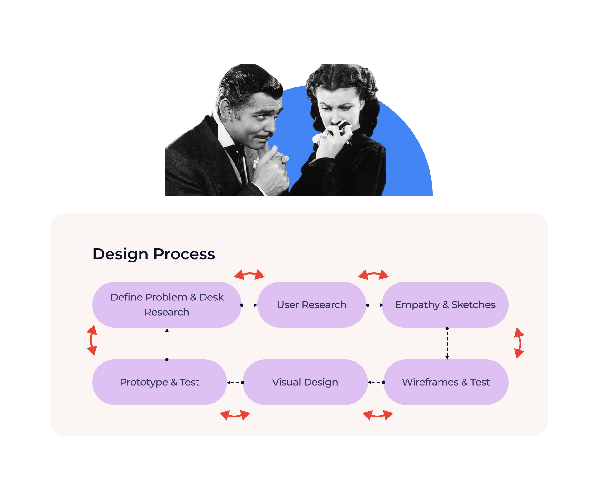
Design Process
Define Problem & Desk Research → User Research → Empathy & Sketches → Wireframes & Test → Prototype & Test → Visual Design.
Storyboard & User Flow
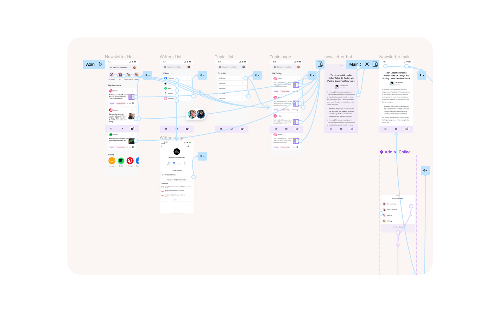
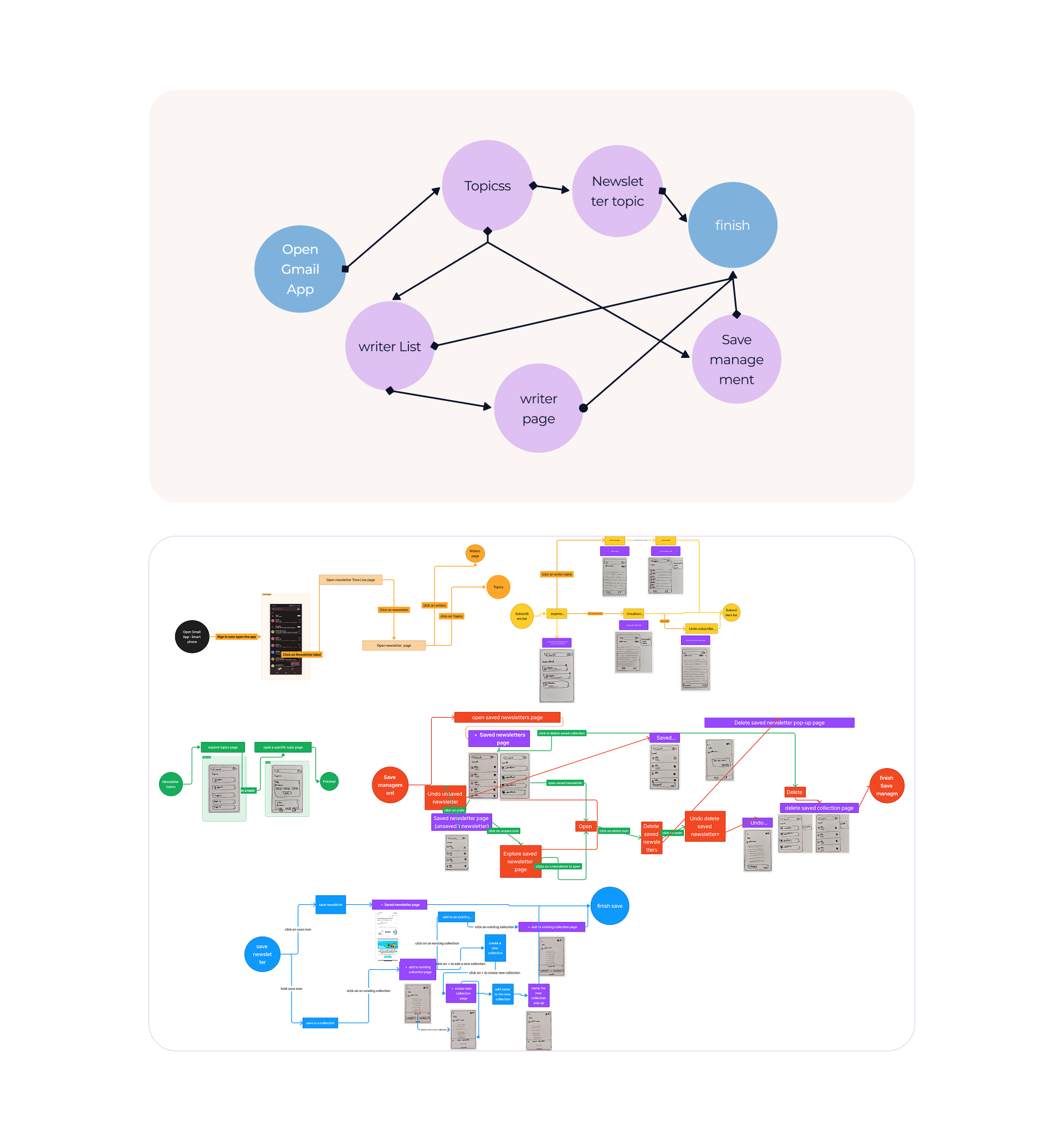
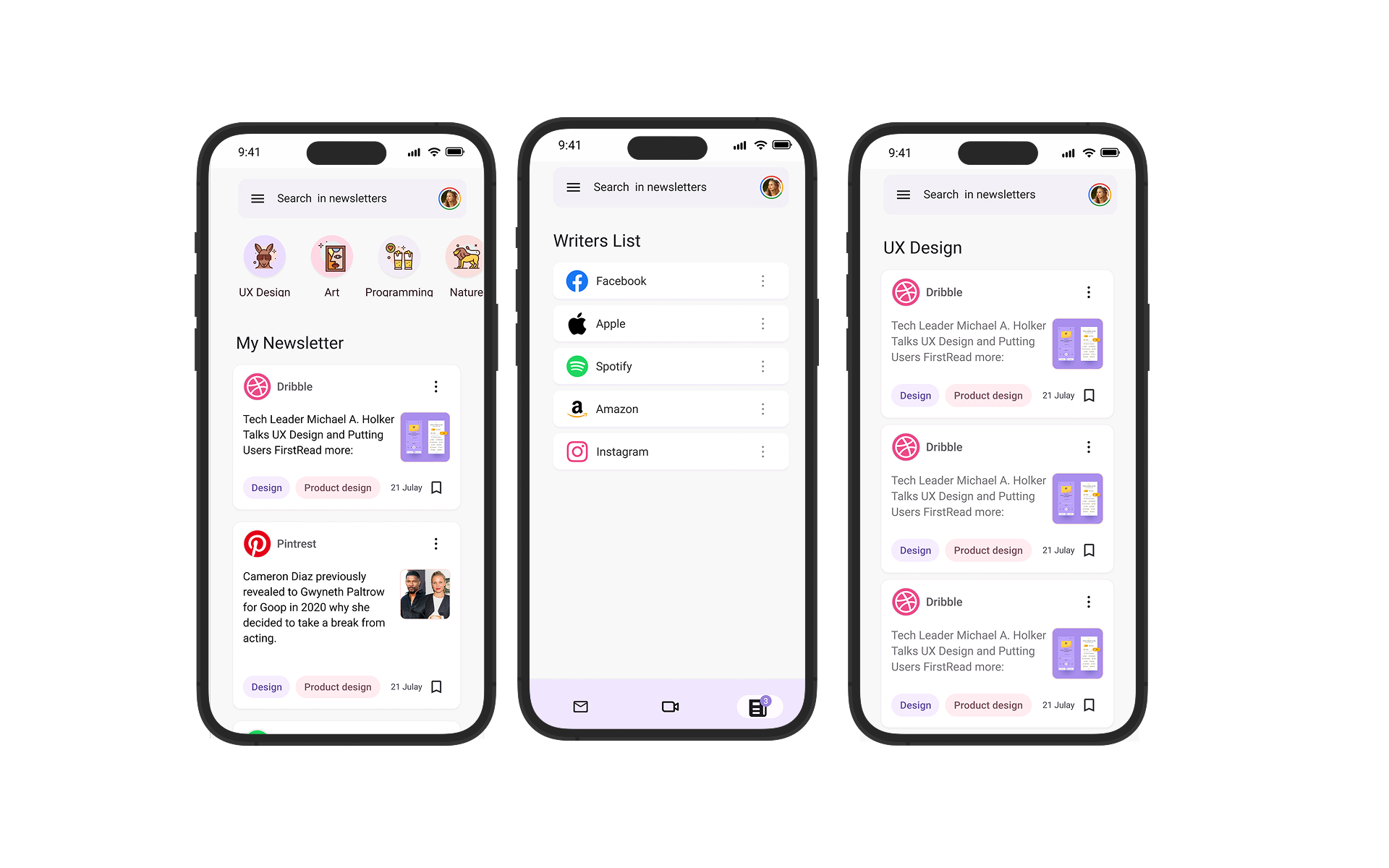
We drew our user flow coming from different user stories to have a better understanding of how users accomplish their goal and how easy-to-use it is. Flow: Open Gmail App → Newsletter topic → writer List → writer page → Save / manage / finish.
Wireframing
We turned our best ideas into low-fidelity and high-fidelity wireframes, both on paper and in Figma. When wireframing, the crazy 8 technique could be super helpful to think of more ideas and find the best match for our goal.
UI Design
Design system: Material Design. As Gmail is Google's product and follows Material Design System, we followed the same design system. Tools: Figma, FigJam. Components and style guide: Material Design 3. We did our best to get deep into components in Figma and design each according to Material Design System principles.
After designing all the pages following Material Design 3 using components and style guides, we came up with the prototyped version of our design.
Prototype & Test
In this phase we tested the flow of reading and saving a newsletter with 5 different people aged 17–29. Then we solved users' issues regarding navigation. View Figma prototype →